In early 2021, we were contacted by the owner of a McMinnville home that was built in 1911 to update some of the interiors. We remodeled both bathrooms and the kitchen. This kitchen project is an amazing example of how important it is to have a properly sized kitchen triangle.
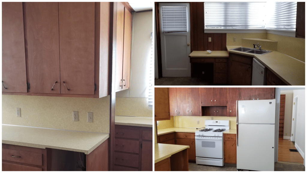
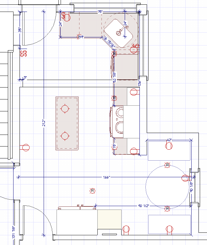
When I first walked into this kitchen I had so many questions, the main one being: How does this function? It may be hard to tell from the pictures, but the stove and the sink were over 13 feet apart, and there was a wall that interrupted the kitchen triangle. My second question was about the awkward cabinetry in the equally awkward alcove pictured above on the left. Everything about the layout of this space felt uncomfortable and impractical.
I could tell just from standing in the room that it was quite out of level. It is believed that at least part of the kitchen (if not all of it) had at one point been a shed addition that was later closed in. The floor dropped nearly an inch from the main entry door to the kitchen to the back door leading outside. It dropped nearly an inch in about 13 feet! If you don’t know anything about floor leveling: that’s a lot of drop. And unfortunately, unless we wanted to remove the back door, open up the wall, and move the header up so the door could sit up a bit more, we would not be able to use self-leveler on the floor. Which meant my only option for flooring material was sheet goods. (Don’t get me wrong, there are some really good quality sheet goods on the market now, I just love a good Luxury Vinyl Tile.)
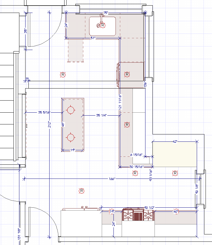
The first floorplan I came up with for the kitchen did not change the location of the work triangle at all (unless you count moving the sink 15 inches to the left – which did mean the wall was no longer interrupting the triangle). I needed to find a way to make the awkward alcove area work because the wall that was creating it was definitely an exterior wall extension, and probably was a support wall, even just in the few inches it jutted into the kitchen. My original plan was to make that space feel a bit like a galley kitchen by removing the cabinets from under the window and turning the alcove into a full-height pantry space.
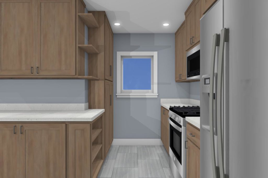
Even with a full 25-inch-deep pantry, and standard 24-inch-deep cabinets on the opposite wall, I still had a walkway of just over 38 inches. At minimum, you want 36 inches of walkway, especially in front of the range. It would be tight, but it would work.
The client also desperately needed a new exhaust fan for the range because the one that was there in the ceiling was no longer functioning. So I planned on an over-the-range microhood. Certainly not the best option for an exhaust fan (I recommend a proper range hood rather than a microhood), but there was limited space for upper cabinets. A microhood with some cabinetry above seemed the best compromise.
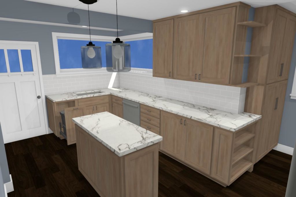
I also decided to play around with the space by adding a small island to the center of the larger area of the kitchen. It felt almost too open in that space when I was originally visiting the jobsite, and the addition of the island meant not only more storage space, but also a secondary work station that was near the range. Plus, it could act as a good drop spot for grocery bags because there was not really enough space for that on the small counter space between the refrigerator and the range. Adding the island took the space from feeling boringly utilitarian to feeling like a well-functioning kitchen.
I presented the concept to the client and he liked it. But I didn’t love it. I felt like the space could be better. And so I went back to the drawing board (or Chief Architect, in this case), and came up with…
And came up with this floorplan! I moved the sink back to the corner because I was having some difficulty getting a garbage and recycling pull-out plus a dishwasher all close enough to the sink to be useful without feeling like you were trapped at the sink if you had either or both open.
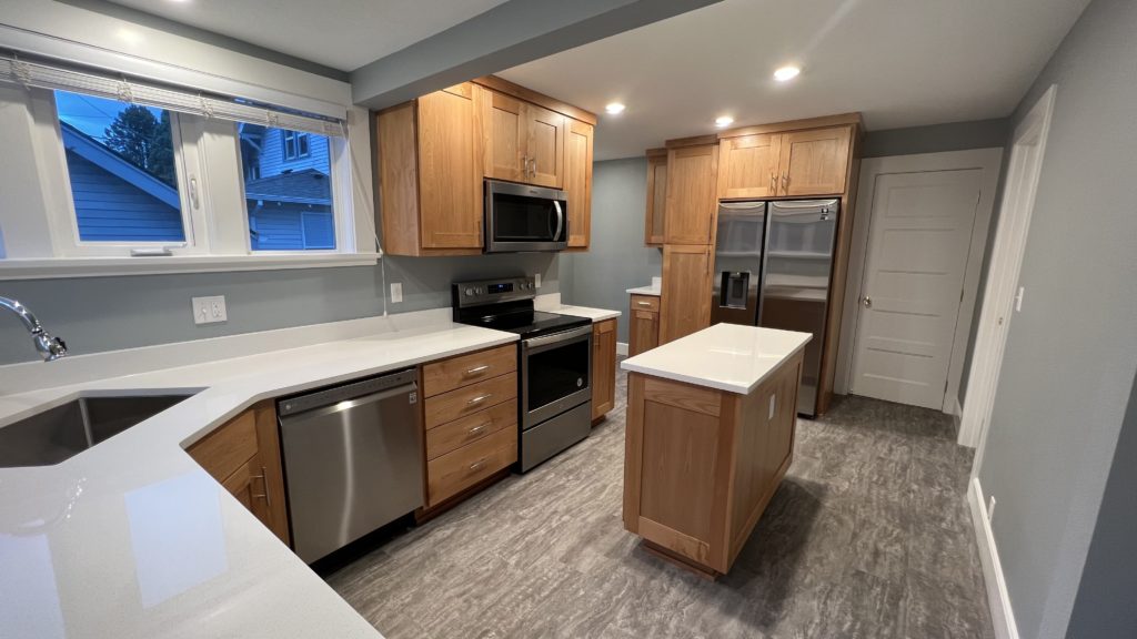
I moved the range so it would be closer to the sink and got rid of nearly 7 feet of kitchen work triangle, making the triangle about 26 feet, which falls in the optimal spacing. (For more about kitchen triangles, check out this design guide.) I moved the full-wall pantry to be next to the refrigerator – and it actually ended up being a bit bigger than shown above.
And the best part of all, in my humble opinion: I created space for a breakfast nook. Who doesn’t love a good breakfast nook?! The addition of the eat-in area really added to the charm of the kitchen, and felt really true to the house’s historical era. The client was happy with the redesign, so we got to work.
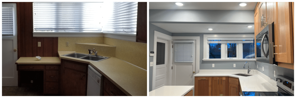
Removing the wood paneling and adding some much-needed ceiling lights really brightened up the space. I went with SW 6234 “Uncertain Gray” for the walls because it’s the prefect shad of blue-gray – timeless and classic, just like this beautiful old house.
The white MSI Q Quartz countertops reflect the new ceiling lights to help add more light to the space, and quartz requires minimal-to-no maintenance. (Read more about different kitchen countertops and their pros & cons here.)
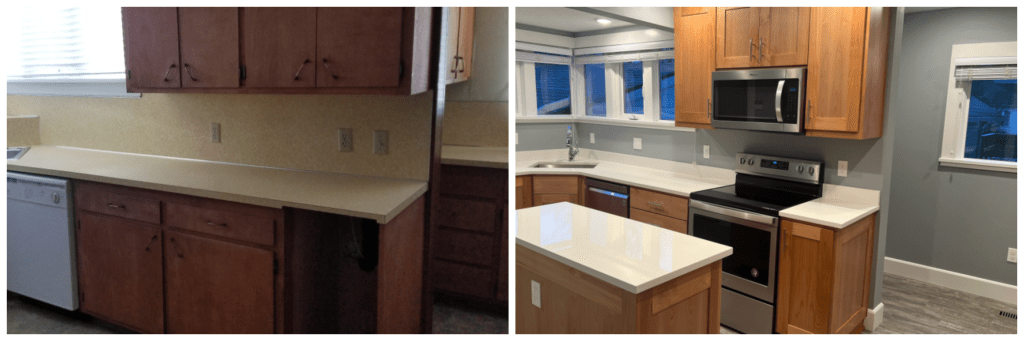
As classic as white cabinets would have been in this kitchen, ultimately we needed to save some costs to hit our budget number, and that meant natural wood. These are clear Alder in a Shaker-style door and slab drawer faces. They still feel authentic to the time period, without being too fussy or offering up a lot of ridges for dust to cling to. (Plus the profile of the Shaker looks so nice with the 5-panel doors.)
The lovely little corner sink helped ensure enough space for both the dishwasher and the garbage pull-out, and keep them both within arm’s reach while standing at the sink.
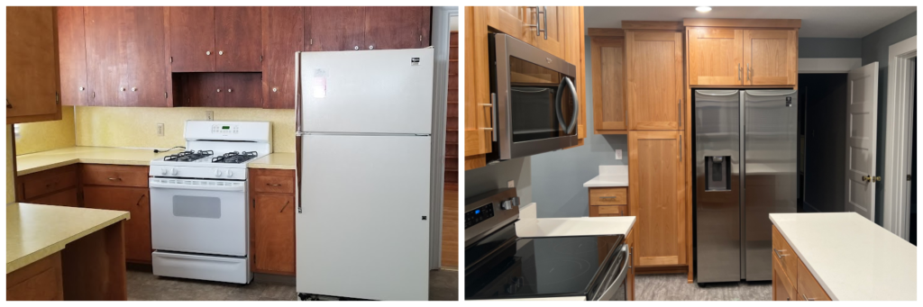
Added space-saving bonus: this refrigerator doesn’t have handles mounted on the front, they are integrated into the doors. It may not seem like much, but the extra 3 to 4 inches makes a big difference. (It’s this one from Samsung.)
Moving the range to an exterior wall ended up being hugely beneficial for our crew as well, making it much quicker and easier to vent the microhood straight out the wall behind it, instead of installing vent ducting in the attic.
As a designer, I could not be happier with the change in this kitchen space. And not only is it so exciting to see my designs come to life, but even more exciting to have a client who is happy and loves what we were able to do with the space.


Recent Comments