Color theory may sound like something that’s only for art students, but anyone who is picking out paint colors should have a basic understanding of color theory.
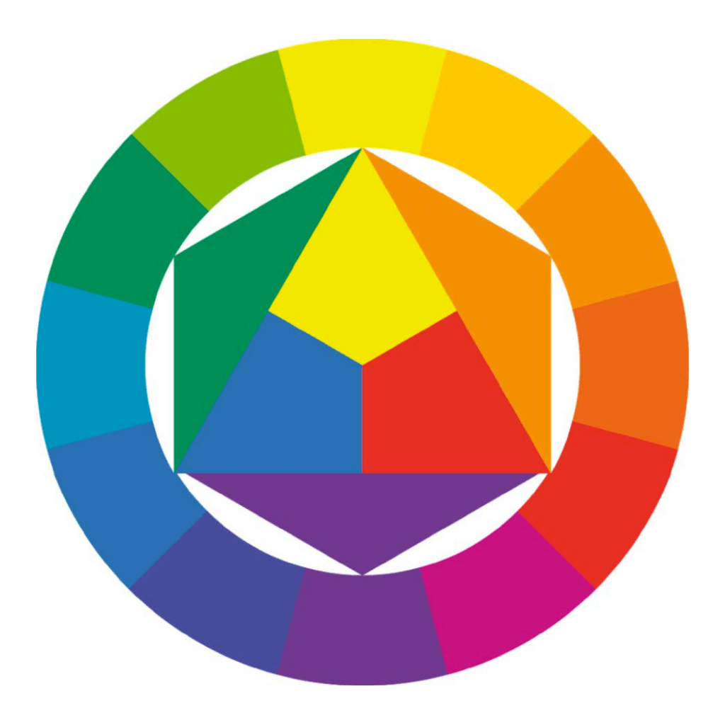
If you passed Kindergarten, you probably remember that there are six colors: red, orange, yellow, green, blue, and purple. (Science makes the distinction between
blues, adding in indigo as a seventh color, but we’re going to stick to Art’s six colors for this conversation.)
There are cool colors – blue, green, and purple – and there are warm colors – red, orange, and yellow.
Red, yellow, and blue are called primary colors because they combine to make all the secondary colors – green, orange, and purple.
There are also tertiary colors: red-purple, red-orange, yellow-orange, yellow-green, blue-green, and blue-purple. This is when a secondary color has more of one primary color
than the other.
HUES V. TINTS V. SHADES V. TONES
Hue: a pure color
Tint: a hue with white added
Shade: a hue with black added
Tone: a hue with grey added
PAIRING AND COMBINING COLORS
There are many different ways colors can be paired and combined.
Complementary colors are the most basic combination of colors. Complementary colors sit directly across from each other on the color wheel. Basic examples of complementary
colors include: red and green; blue and orange; yellow and purple.
Analogous colors are 3-4 colors who sit adjacent to one another on the color wheel. For example, blue-purple, purple, and red-purple. Analogous colors give off a harmonious
feeling.
Split-Complementary might be a bit confusing, so follow me on this one: the main color and the two colors adjacent to the main color’s complementary color. So say your main
color is red. It’s complementary color is green, so red’s split-complementary colors would be yellow-green and blue-green. (Now might be a good time to scroll back up to the
color wheel.)
Triadic colors are 3 colors that are equally spaced around the color wheel. This one can get confusing depending on the color wheel you look at because everyone spaces
things a bit differently, but just as a basic reference, the primary colors (red, yellow, blue) are also a triadic pairing, as are the secondary colors.
COLOR PSYCHOLOGY
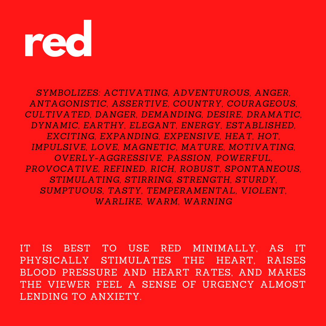
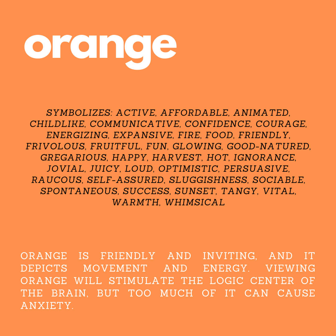
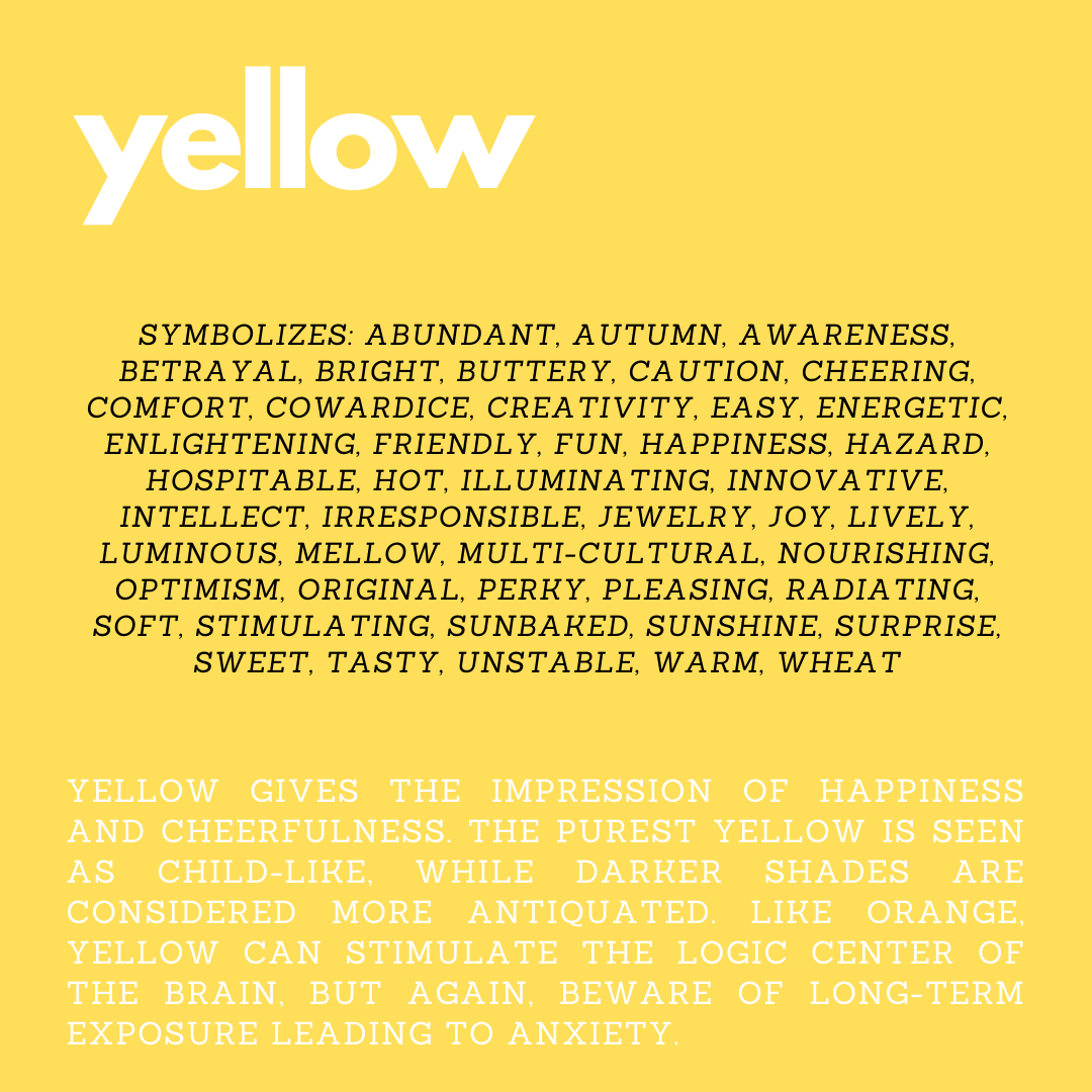
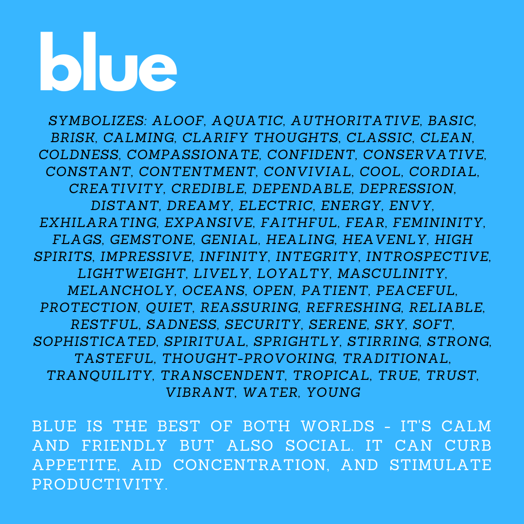
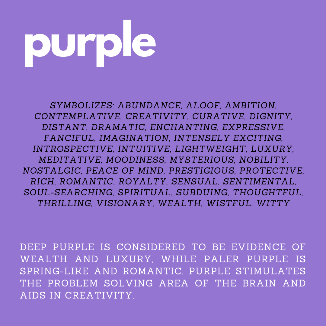
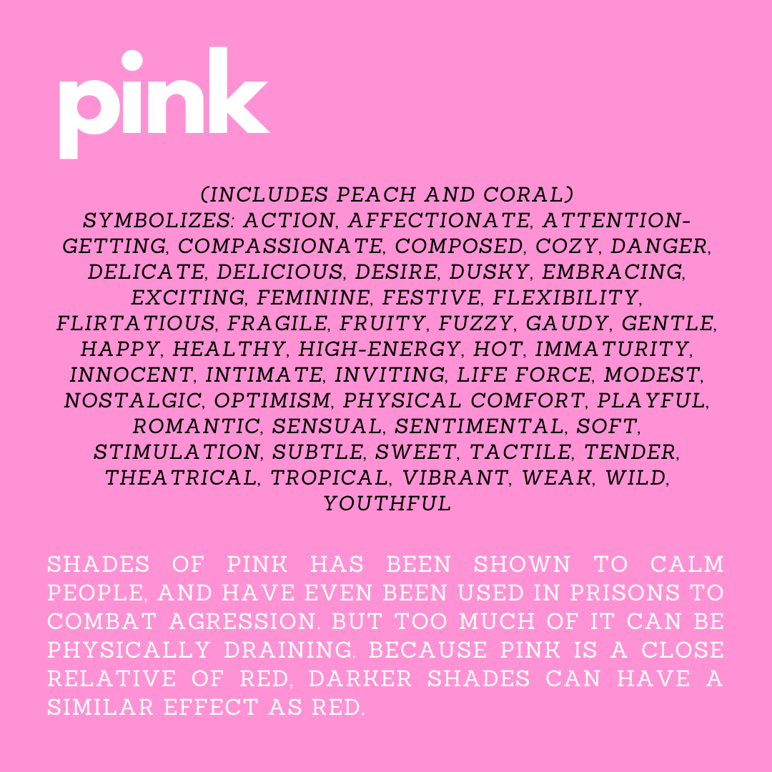
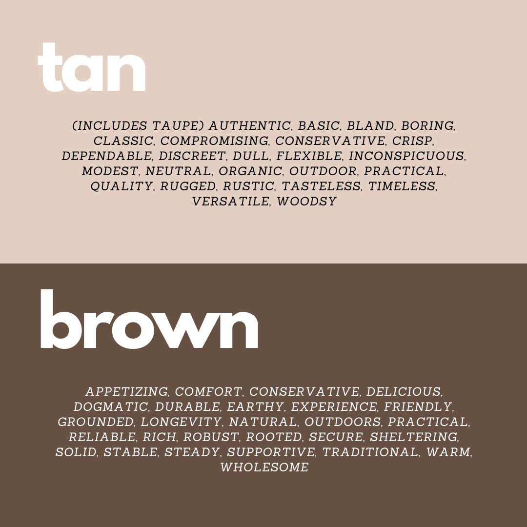
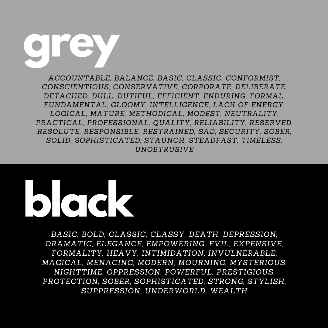
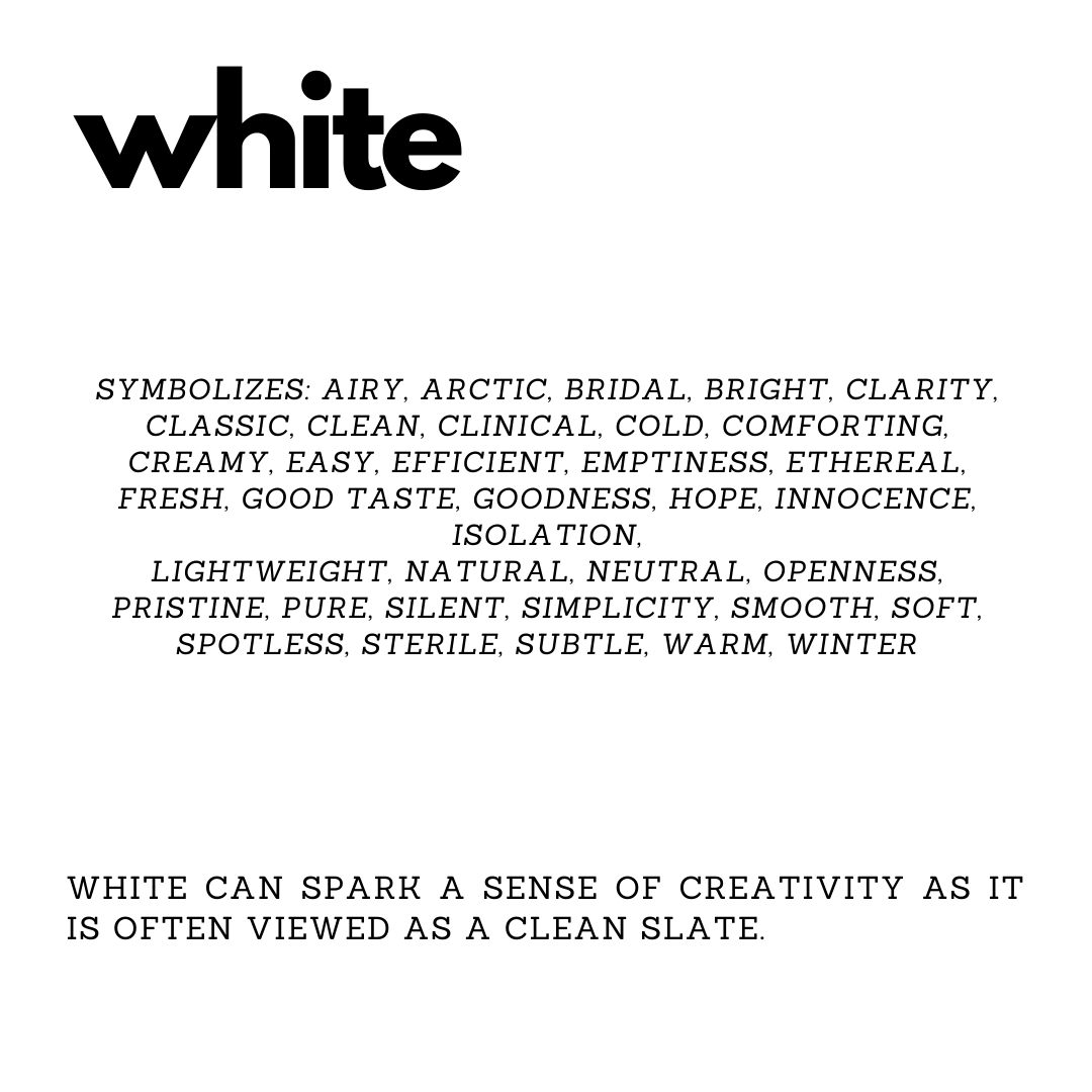
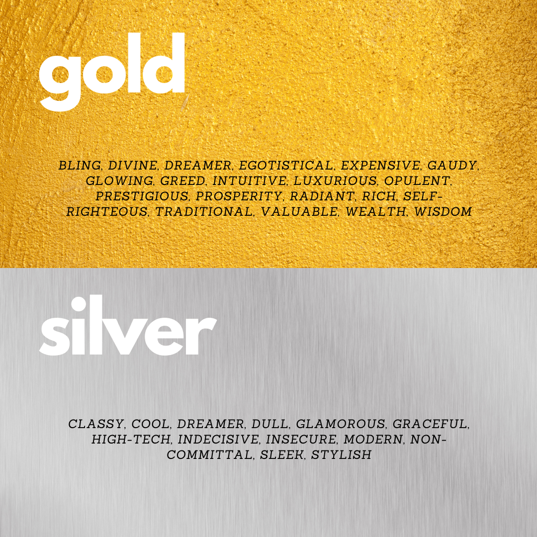
Now to the important stuff – colors express emotion. This might seem like a “duh” moment, but not everyone is aware that colors have as strong of an effect as they do. The following section will go into a bit of detail about what each color can symbolize (both positive and negative) and some of the physical effects they can have. (Keep in mind that this is specifically as these colors relate to Western Culture.
As you can see, colors can have a lot of meanings and both positive and negative effects on the brain (and ultimately the body). It’s important to figure out what each color means to you and how it effects you. This will help you decide where and how to use each color. For example:
- Blue can curb appetite, you probably shouldn’t use it in a kitchen or dining room, but an office would be a great place for it since it stimulates productivity.
- Warm colors can lead to anxiety with long-term exposure, so they aren’t good colors for a bedroom, but pops of orange or yellow or red in a workout room can help with temporary stimulation to encourage you to be active.
One of the best ways to get the positive effects of color is to use whites that have the undertone of another color or pastels. Using neutral colors like tan, brown, white, grey, or black as your main color, and adding pops of brighter accent colors is also a great way to bring in color without feeling overwhelmed. This way, you can easily change colors when you feel it isn’t working the way you want it to in the room it’s in.
If you are interested in learning more about color theory and the psychology of color, check out your local library or see if your local community college offers any art classes.


